Buttons and links
The following information comes from the Accessibility Cookbook and has been modified for native mobile apps.
Choose the right component: buttons vs. links
Many people struggle to select the right element when choosing between a button or link. Making the right choice can help make an interface easier to use, especially for people who use assistive technology. Buttons and links are the primary ways users interact with information in a native mobile app.
Remember: Links are for navigation and buttons are for action.
Accessibility problem being solved
In general, links should look like links and buttons should look like buttons. This improves usability and accessibility by:
- setting honest expectations of interaction behavior
- providing clear signifiers of affordances
- creating experiences that are consistent with native mobile app standards
Assistive technology users may choose to navigate by buttons or links, depending on what they’re looking for. It’s vital that our content meets users’ expectations. For example, links coded as buttons could make those links hard to find.
Ideal state
- Buttons are:
- Used for actions, including:
- Submitting a form
- Opening a fullscreen subtask
- Changing the state of something (such as “Back / Continue” buttons on a form)
- Expanding something (like an accordion)
- Created using the button component
- Styled to look like buttons and should not include link signifiers, such as underlines
- Used for actions, including:
- Links are:
- Used for navigation:
- Navigation bars (bottom and header)
- Links to child screens
- Links to large panels
- Links to external websites
- Links to PDFs
- Created using the link component
- Styled to look like links and shouldn’t include button signifiers, such as borders
- Used for navigation:
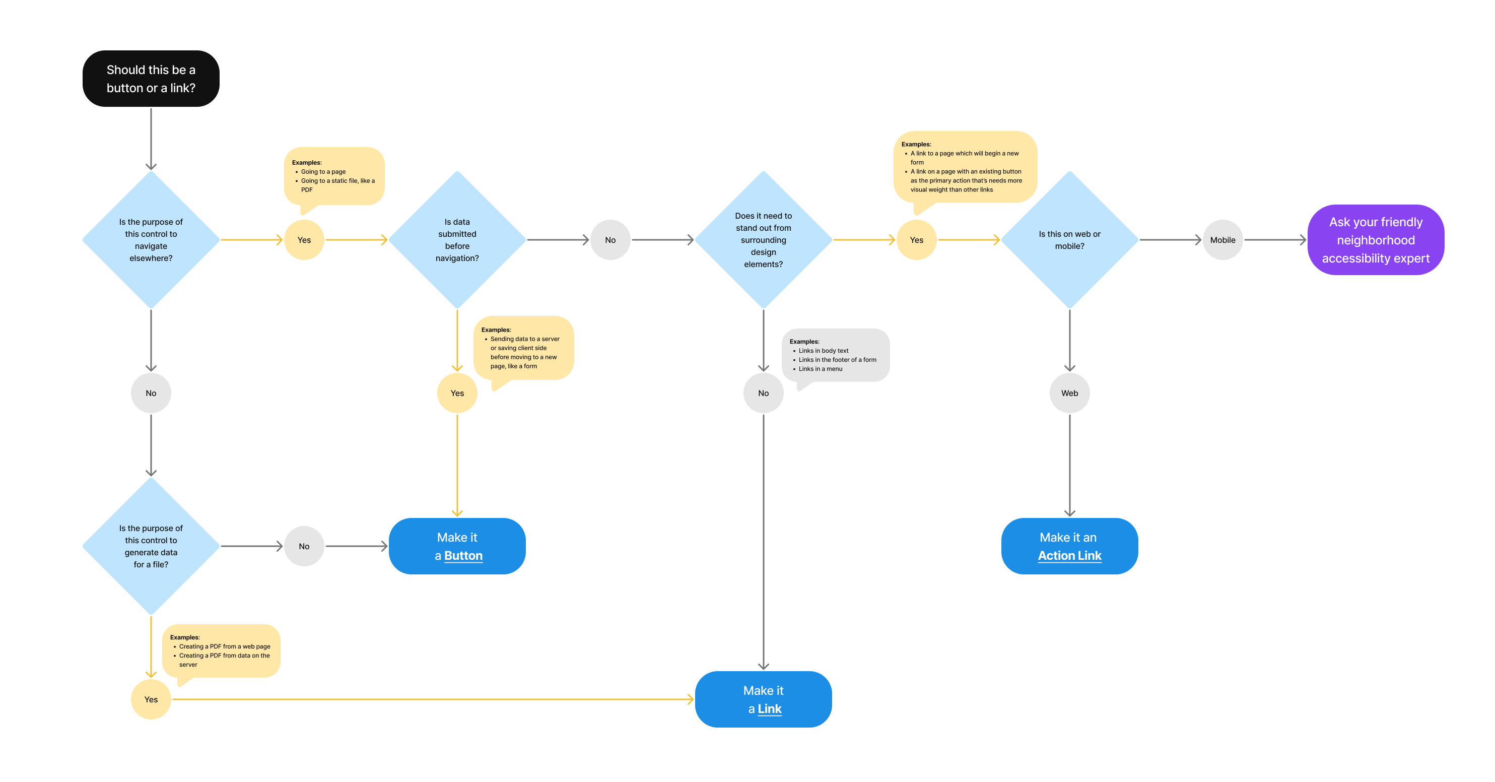
Should this be a button or link?

- Is the purpose of the control to navigate elsewhere?
- Yes
- Examples: Going to a page; Going to a static file, like a PDF
- Is data submitted before navigation?
- Yes
- Examples: Sending data to a server or saving client side before moving to a new page, like a form
- Make it a Button
- No
- Does it need to stand out from surrounding design elements?
- No
- Examples: Link in body text; Link in the footer of a form; Links in a menu
- Make it a Link
- Yes
- Examples: A link to a page which will begin a new form; A link on a page with an existing button as the primary action that’s needs more visual weight than other links
- Is this on web or mobile?
- Mobile
- Ask your friendly neighborhood accessibility expert
- Web
- Make it an Action Link
- Mobile
- Is this on web or mobile?
- Examples: A link to a page which will begin a new form; A link on a page with an existing button as the primary action that’s needs more visual weight than other links
- No
- Does it need to stand out from surrounding design elements?
- Yes
- No
- Is the purpose of this control to generate data for a file?
- Examples: Creating a PDF from a web page; Creating a PDF from data on the server
- Yes
- Make it a Link
- No
- Make it a Button
- Is the purpose of this control to generate data for a file?
- Yes